


ANCHOR LAND:
OVERVIEW
Anchor Land Holdings, Inc. is an esteemed property developer in the Philippines. Its diverse portfolio includes commercial, retail, office, warehousing, and hotel and resort developments—all of which are anchored on the company's promise of excellent value.
WHAT WE DID
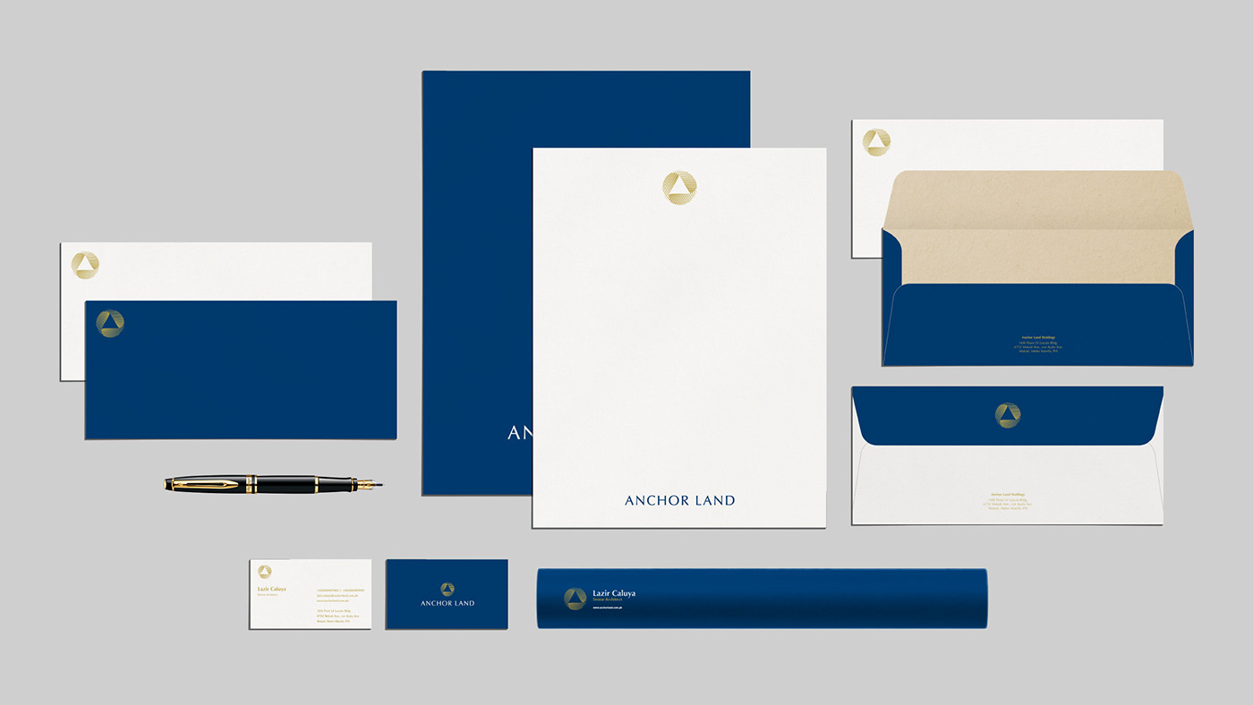
Brand Identity
Brand Identity

THE CHALLENGE
With its years of experience and success in the industry, Anchor Land needed an updated look to match its position in the market. The brand wanted to exude professionalism, prestige, and sophistication—which were values it certainly embodied, but the existing visual language did little to create a strong profile for the brand.
With its years of experience and success in the industry, Anchor Land needed an updated look to match its position in the market. The brand wanted to exude professionalism, prestige, and sophistication—which were values it certainly embodied, but the existing visual language did little to create a strong profile for the brand.

THE SOLUTION
We aimed to craft a brand identity that was meaningful to the essence of Anchor Land and its brand promise. That said, we put our focus on what it valued and made sure to concretize them in its renewed identity.
1. Unparalleled excellence
2. Commitment to growth
3. Prestigious value

Anchor Land's logo icon is made up of two contrasting key elements: the triangle and the circle, each with its own meaning.
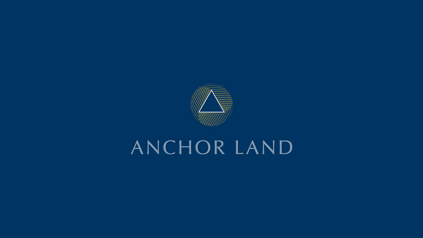
The triangle is representative of Anchor Land itself, being similar in shape and form to the letter 'A.' Taking inspiration from the name, "to anchor" is defined as securing firmly in position or providing a strong foundation, one that also connotes strength and stability.

The circle, on the other hand, is often a representation of perfection in the language of shapes, which we've likened to Anchor Land's commitment to excellence. The shape is also representative of perpetual motion, mirroring the brand's thrust towards growth and innovation. In contrast to the triangle, the circle introduces an element of dynamism and fluidity.

The two shapes together communicates Anchor Land's brand promise. The triangle within the circle puts Anchor Land at the center of growth and excellence.


While the logo focused on the brand's unparalleled excellence and commitment to growth, we wanted the colors to touch on its desire to communicate its prestigious value. Its original color palette focused on a dark red, paying tribute to its roots in Manila Chinatown. However, this didn't particularly communicate the brand's high-end value. Instead, we chose a dark blue which symbolizes abundance, balance, and prestige. The specific hue perfectly complements the gold that we introduced, which adds a touch of luxury and sophistication to the overall look and feel.


YOUR BEST INVESTMENT
Visit Anchor Land's website for more information.


